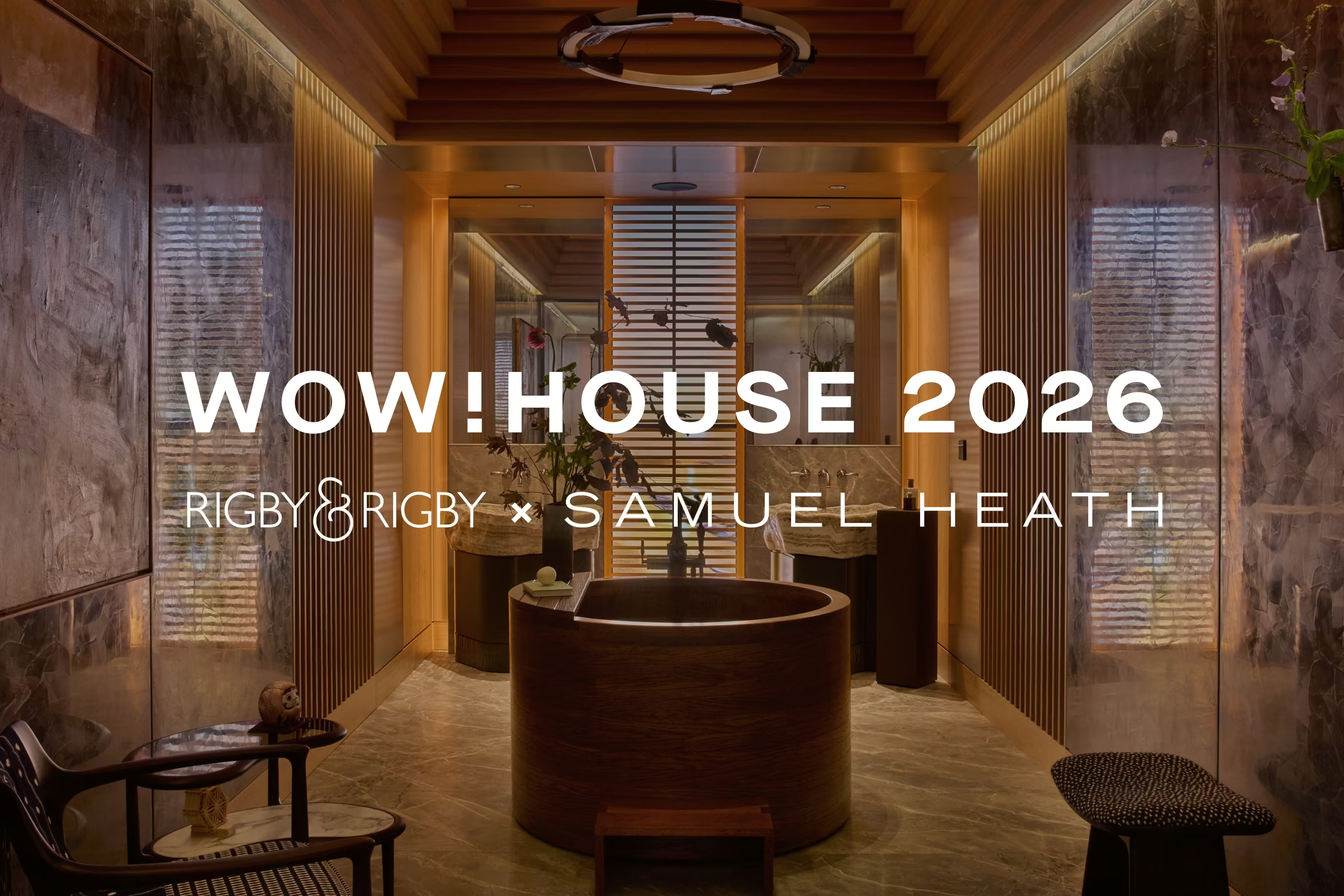


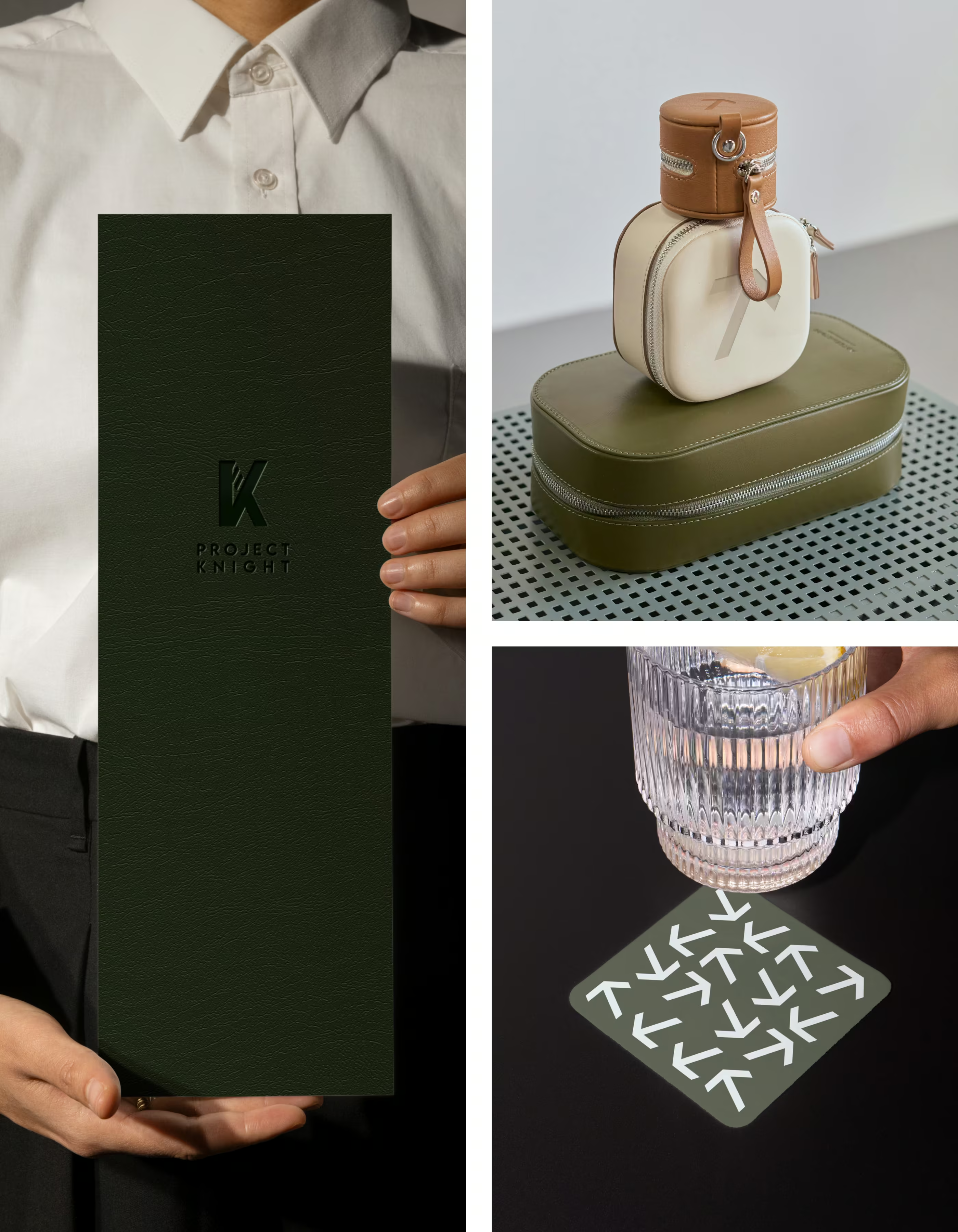
Identity in flight: Branding Project Knight

Rigby & Rigby’s work on the Gulfstream G700 private jet, Project Knight, extends beyond crafting a beautifully refined interior; it embraces a fully integrated design approach where space, materiality, and identity work in harmony. The jet’s interior—defined by its calm palette, meticulous detailing, and sophisticated use of natural materials—creates an environment of effortless luxury. To enhance this experience, a bespoke branding system was developed in parallel, designed to complement the interiors and express the owner’s personal narrative in a subtle, modern way.

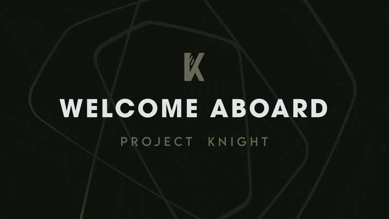
The Logomark
At the heart of the identity is the newly designed “K” emblem—a sharp, modern monogram defined by bold geometric forms. The angled strokes and split detailing create a sense of motion, symbolising the elegant descent of an aircraft coming in to land. Its clean precision and contemporary structure establish a confident visual language, one that feels dynamic yet refined. This emblem becomes the anchor of the brand, guiding everything from spatial graphics to digital elements on board. From this foundation, an arrow motif emerges—derived from the emblem’s geometry—serving as both a functional wayfinding device and a refined decorative element across the full suite of branded deliverables.
The Map
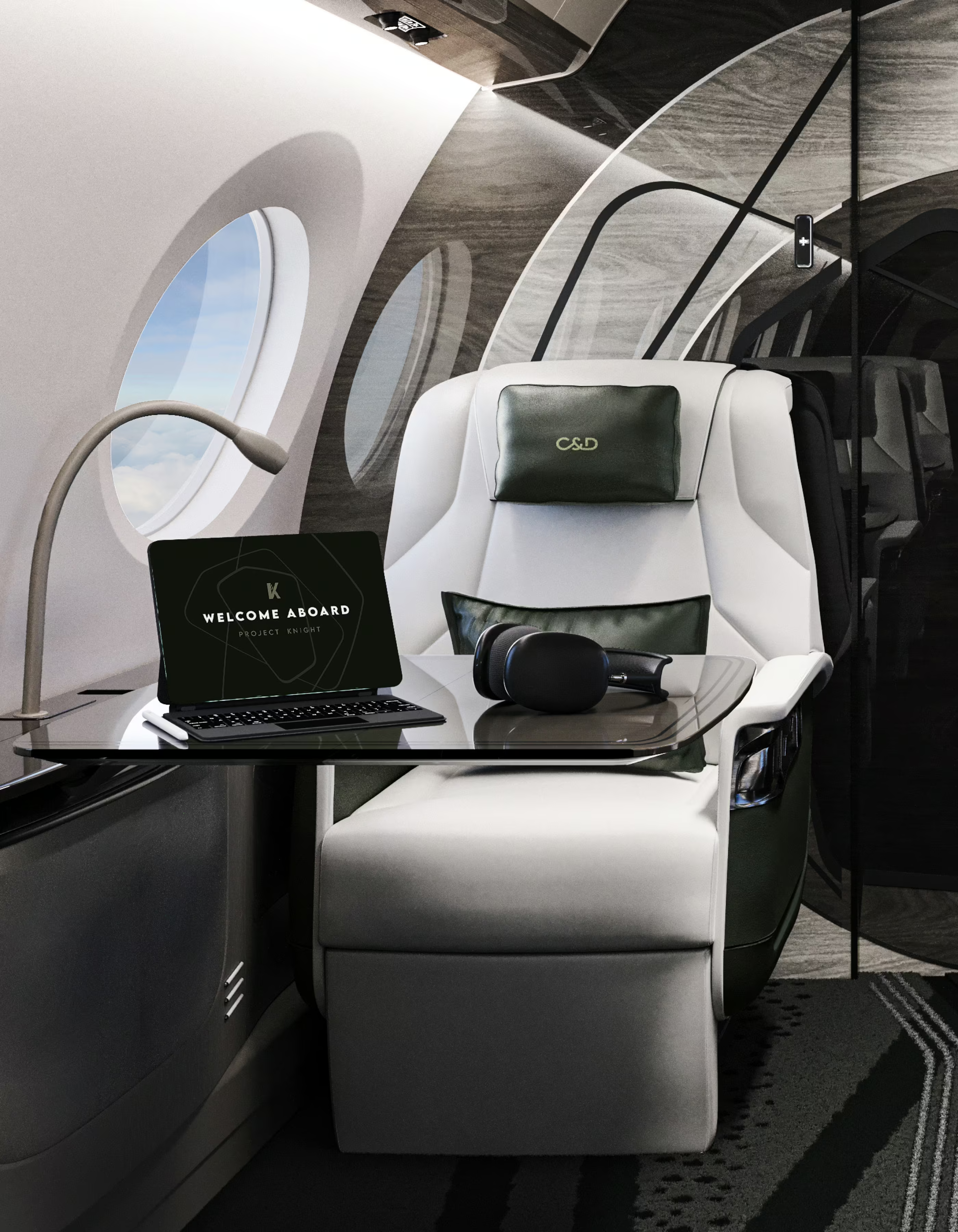
This branding approach extends beyond static design. A bespoke animation has been developed for the jet’s onboard displays, drawing inspiration from an abstracted map of the owner’s global properties. The graphic language originates in the bulkhead design and is echoed in the carpet that runs throughout the cabin, creating a cohesive visual thread. The animation introduces a digital storytelling layer—celebrating the owner’s international lifestyle while reinforcing the aircraft’s distinct sense of purpose and identity. In doing so, it elevates a functional touchpoint into a signature experience, adding depth and emotional resonance to the journey.
The Monogram
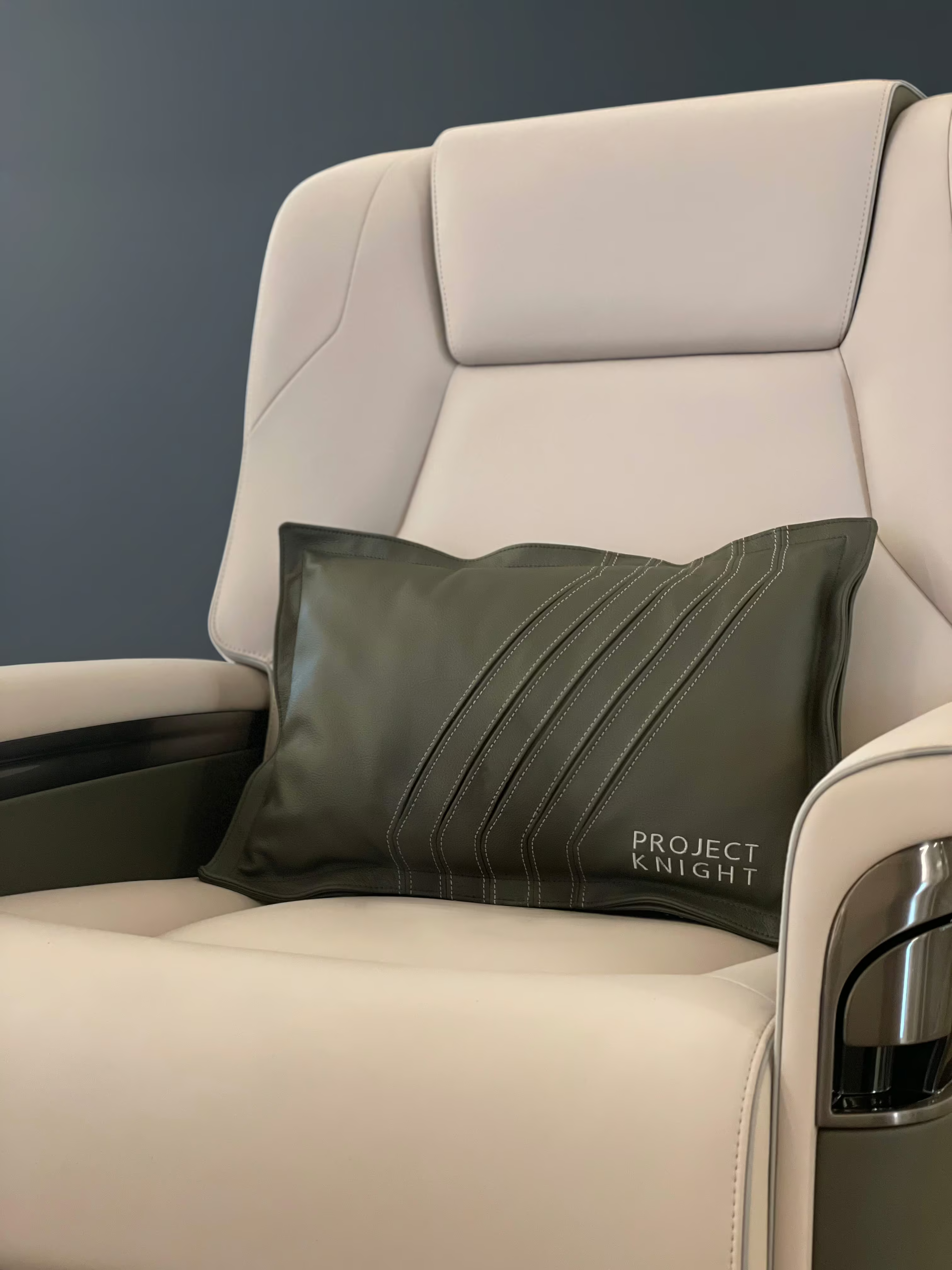
To complement this, a custom monogram was introduced for the jet’s headrests. Refined, discreet, and tailored, the monogram adds a tactile expression of identity within the cabin. It acts as a subtle reminder of ownership and exclusivity, seamlessly integrated into the material palette without disrupting the calm, luxurious atmosphere of the interior.
The Exterior
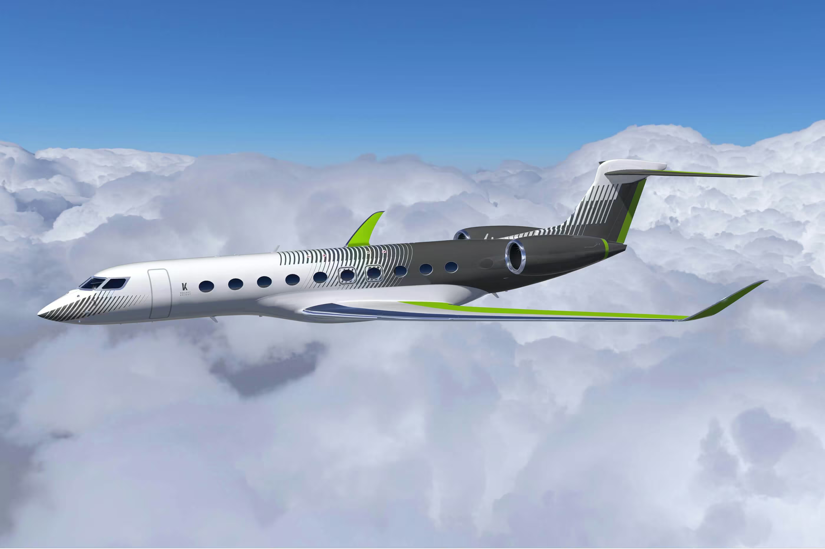
The branding carries through to the aircraft’s exterior, where precise, modern line work—as seen in the livery’s layered striping—echoes the emblem’s sense of motion and refinement. From the outset, the brief was clear: to make the jet appear faster, even when stationary. Achieving that sense of visual acceleration required rigorous exploration, with more than 80 design iterations developed in close collaboration with three additional design studios before arriving at the final solution. The carefully executed lines wrap around the fuselage with architectural clarity, creating a dynamic visual flow that enhances the aircraft’s proportions and amplifies the perception of speed without overpowering its form. This exterior treatment forms a seamless bridge between the aircraft’s identity and its physical presence, ensuring the brand is recognisable from the very first glance.

Together, these elements create a branding ecosystem that is modern, personal, and deeply intentional. Rather than simply decorating the aircraft, the branding enhances its story—aligning design, technology, and personal expression in a way that feels both innovative and timeless. By embedding identity into every touchpoint, the G700 becomes not just a private jet, but a curated brand experience in flight.
%20(1).avif)