P2 Eastpoint

See Project P2 Eastpoint
Rigby & Rigby are proud to announce their latest luxury brand identity project, P2 Eastpoint - a premium workspace development by REIL Investment.

Situated between Dublin's city centre and the coast, P2 Eastpoint's strategic location offers a harmonious blend of urban energy and coastal tranquillity, reflected in its branding through the juxtaposition of edges and curves, boldness and softness, and modernity with warmth.
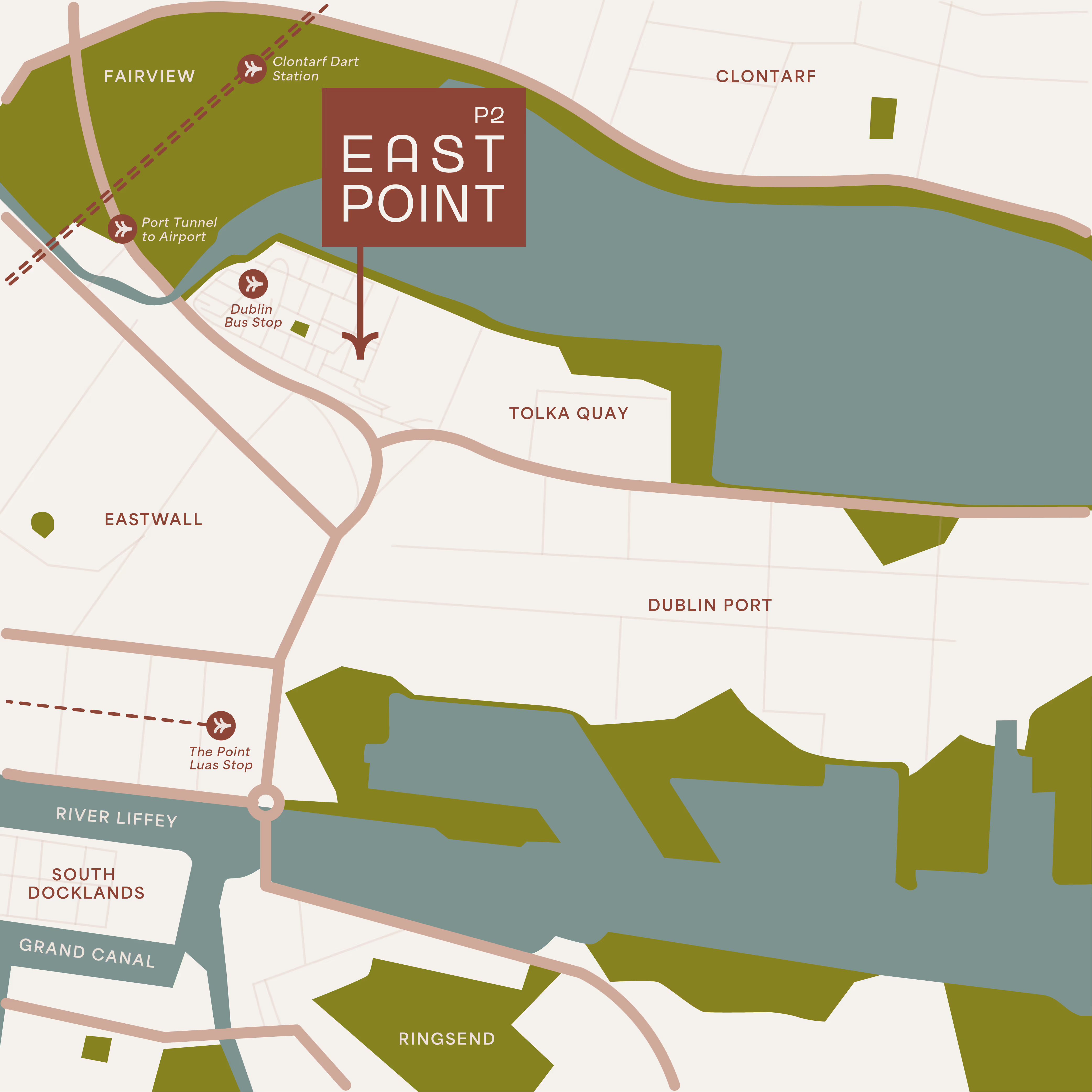
The brand identity features a bold, contemporary logo with wide curves, reflecting the architectural language of the interiors and embodying both structure and adaptability. To ensure versatility across various formats, a secondary logo lockup and monogram were created, maintaining a cohesive visual identity. The colour palette consists of rich, autumnal hues—deep rust red, soft latte white, and dark russet brown—enhancing the brand's warm and sophisticated appeal.

Signature semi-circular shapes extend beyond the logo, forming subtle patterns and elegant frames for text and imagery.

Additionally, five bespoke icons were designed, each derived from the logo's geometric forms, representing Innovation, Flexibility, Sustainability, Luxury, and Wellness.

Photography and film guidelines ensure that all brand visuals, from the website to brochures and social media, convey a fresh, natural, and aspirational aesthetic—combining a crisp, clean look with inviting warmth.
.jpg)
The overall ambiance is reminiscent of a moment of calm before the workday begins, like the first cup of coffee before opening your inbox, setting the tone for an environment that is both inspiring and functional.

"Our initial strategy for this project was to create an identity that perfectly reflects the 5 core values of P2 Eastpoint. Simple, bold type creates a luxury base to build the brand, whilst subtle yet striking quirks in the logo suggest a sense of innovation. A soft and earthy colour palette insinuates sustainability, whilst the wide, rounded curves in the logo and brand language create a welcoming aesthetic to tie into the wellness element. The logo lockup, monogram and iconography result form a toolkit that can adapt to any and all applications. Overall, the success of this project lies in the simplicity of it. Whilst still being distinctive and unique, the geometry and assets are flexible enough to evolve and develop, making it a truly timeless brand."
- Daisy Watson, Graphic Designer


