%20(1).avif)


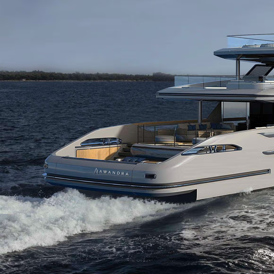
Awandra Superyacht
See Project Awandra Superyacht
Rigby & Rigby's Creative Division are thrilled to announce their latest luxury brand identity project for a private client family superyacht, Awandra.

Awandra is a portmanteau of the client's family initials 'AW' and Avandra, the Goddess of Freedom, Travel, and Adventure. Also known as "She who makes the Path", we aimed to create an identity that represented strength, flow and change.
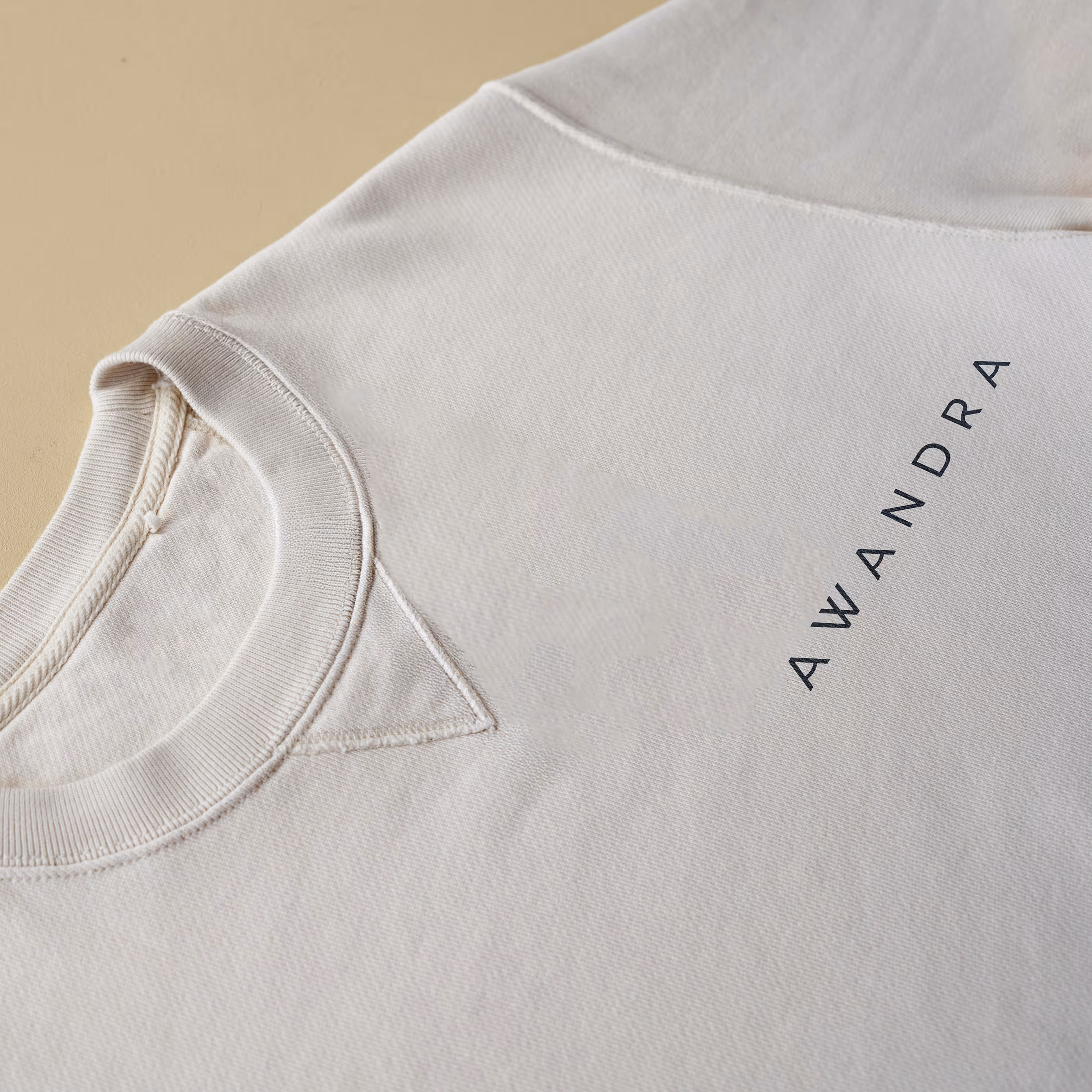
The logotype is a perfect blend of strength and lightness. A bold, geometric font is softened with subtle curves and rounded corners, echoing the movement of the sea. It is contemporary and luxury, whilst retaining a welcoming warmth.
.avif)
Meanwhile, the logomark is designed to be both an abstract representation of a lighthouse, and of the AW monogram. It shares the same strength and softness of the logotype, with an asymmetrical bold geometry, rounded vertices and a distinctive wave form at the centre of the design.

These logos were then materialised into backlit steel signage on the stern and sun deck and embedded into the timber flooring of the swim platform.
To complement the logo set, a colour palette, typographic system and pattern library were designed to help guide all future design elements, such as stationery, uniforms, and on-board essentials like beach towels, dry bags and floating key chains.
%20(1).gif)
The colour palette is formed of rich sea blues, sable gold, and a warm 'sea foam' white. Typography is clean and simple, allowing the logos and patterns to form the focal point. One pattern is the logotype modified into a repeating wave pattern, whilst the other comes from enlarging and cropping the logomark to form abstract shapes.

"There were two pivotal moments when designing the identity for Awandra. The first was during the initial research and concepting stage, where we familiarised ourselves with existing nautical branding, and quickly realised that to be a timeless and sophisticated brand, we would need to tread the line of referencing nautical iconography carefully. As such, the logotype has clean and aesthetically pleasing forms, with a subtle undulating wave running through the 'A's and the R.
The second moment was in the development of the logomark. With little to no imagery of the Goddess Avandra, and a desire to hide the monogram in plain sight, we designed over 100 iterations for the logomark, with themes including Avandra parting the water, the wake of the boat, and liquified geometries. In the end, the idea was to represent the lighthouse that the family grew up next to, with the 'A' from the logotype, and a cursive 'W', intended to look like a crashing wave. This was then refined to balance the decorative, feminine elements with the bold, simplicity of the logotype."
- Daisy Watson, Graphic Designer